5 Free Fonts for Web 2.0 Logo
Simplicity is probably the main factor determining if a Web 2.0 logo is nice. To contribute to simplicity combination of font colors and style plays a major role. Fonts need to be blatantly big with smooth gradients and its utmost important to get the right font style, else it’ll just don’t look right. In a nutshell, good font style with the combination of the right colors made up a good Web 2.0 logo.
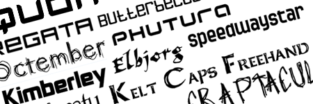
I hope most of you agree with me so far. Few readers has been asking me which particular fonts were used in other Web 2.0 logo (including my logo) after this entry but see, the point is some of these Web 2.0 out there are using pay fonts. Even if you know you’ll need to buy them; and if you buy them you just ending up having something similar to their Web 2.0 logo.
So how about getting some free fonts to start your own Web 2.0 Logo design? Using UrbanFonts.com as reference, here are 5 beautiful free fonts for Web 2.0 logo design.
1. Baar Sophia [ Preview ]

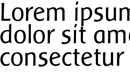
2. MarlonBook DB [ Preview ]

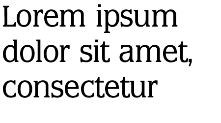
3. Perspective Sans [ Preview ]

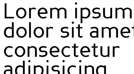
4. Thryomanes [ Preview ]

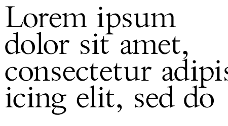
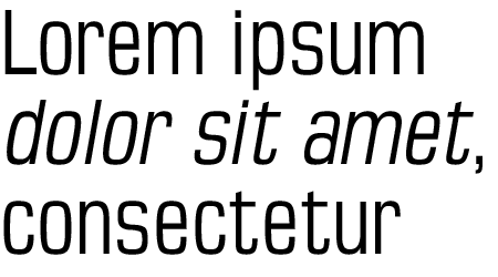
5. MKSans TallX [ Preview ]

0 nhận xét:
Đăng nhận xét